Logo Design & Brand Exploration
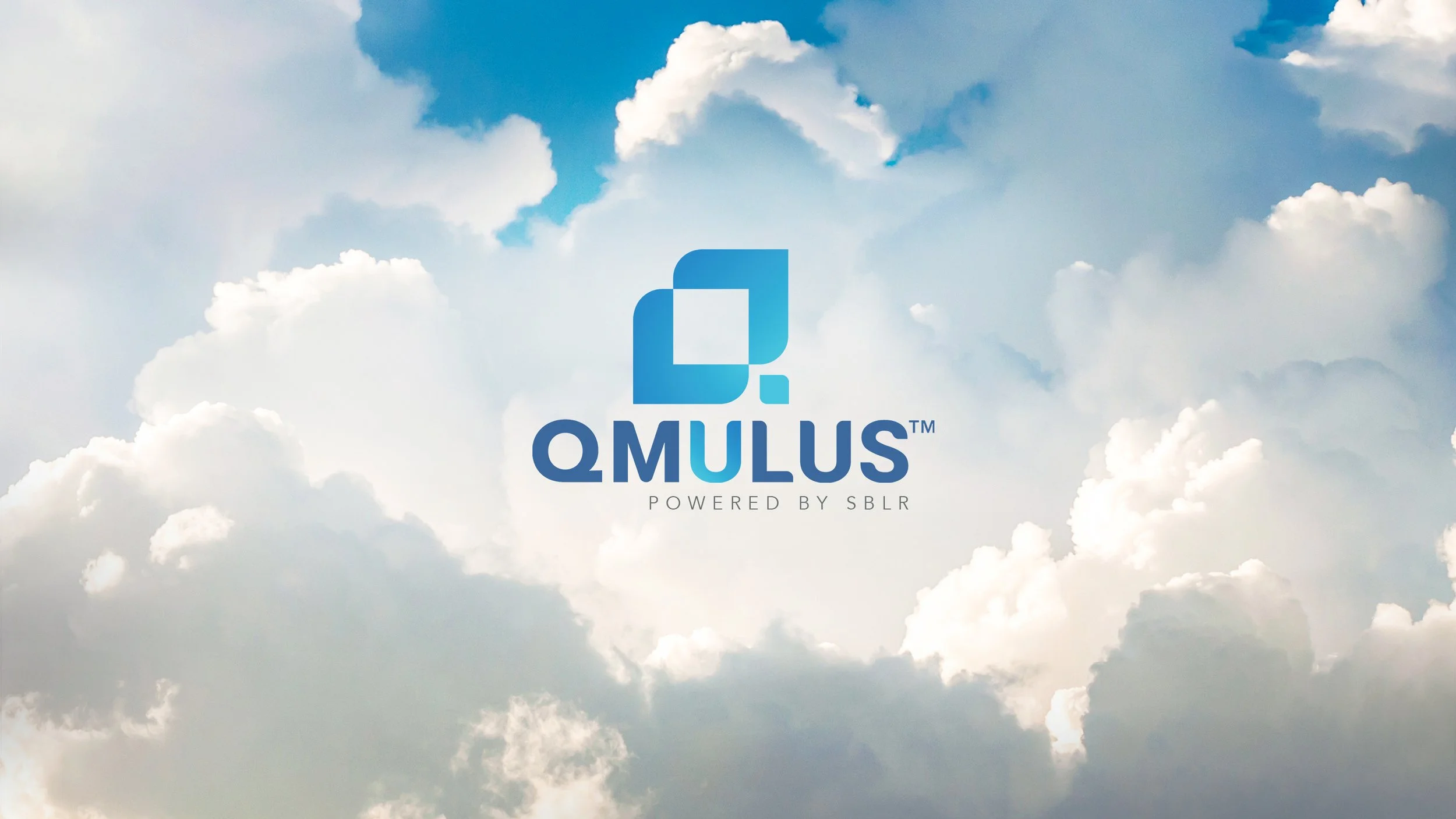
Qmulus Brand Logo
Client SBLR wanted to develop a name and visual identity for their new financial cloud service. They gave creative freedom with the name and identity during brainstorming to explore different shapes, colour palettes, and symbolic elements.
Exploring Name & Branding Possibilities
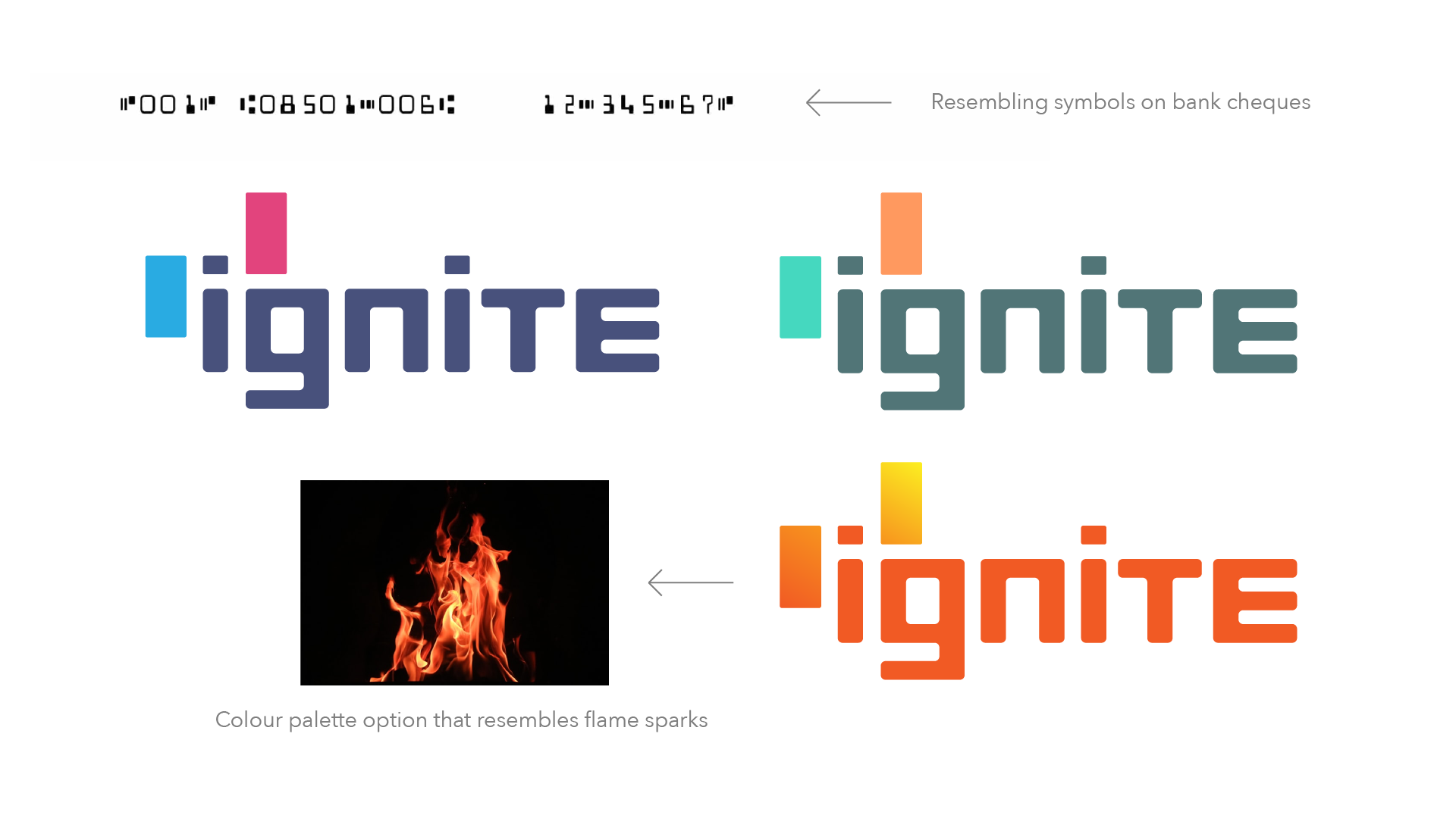
Brainstorm session - Logo & Name 1: A bold name featuring rectangular custom font and elements incorporated into the “i,” echoing the shapes used on bank cheques. The design aims to convey a sense of empowerment, signaling to customers that the service enhances their financial control.
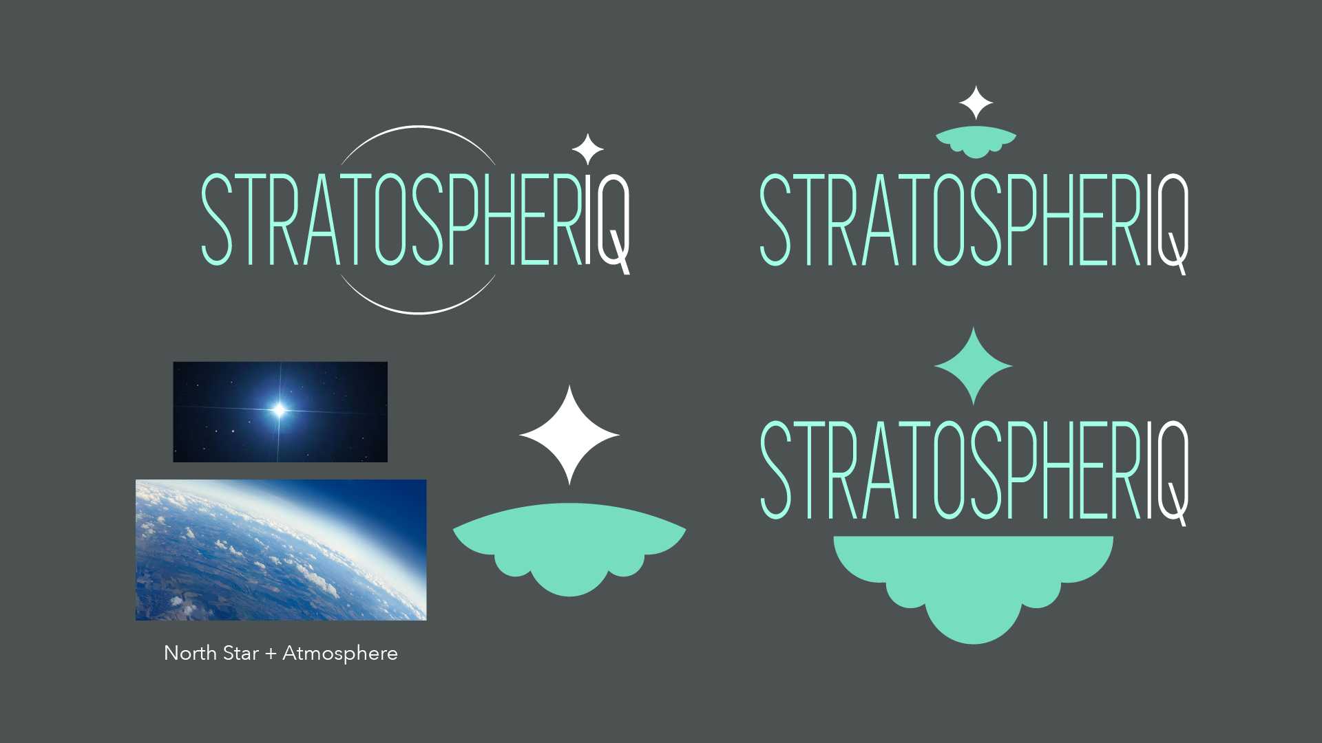
Brainstorm session - Logo & Name 2: SBLR wanted their cloud service to feel “above and beyond.” I took that literally, imagining what’s beyond the clouds to amplify its exceptional nature, dramatize superior capabilities, and position it as a standout, forward-reaching solution.
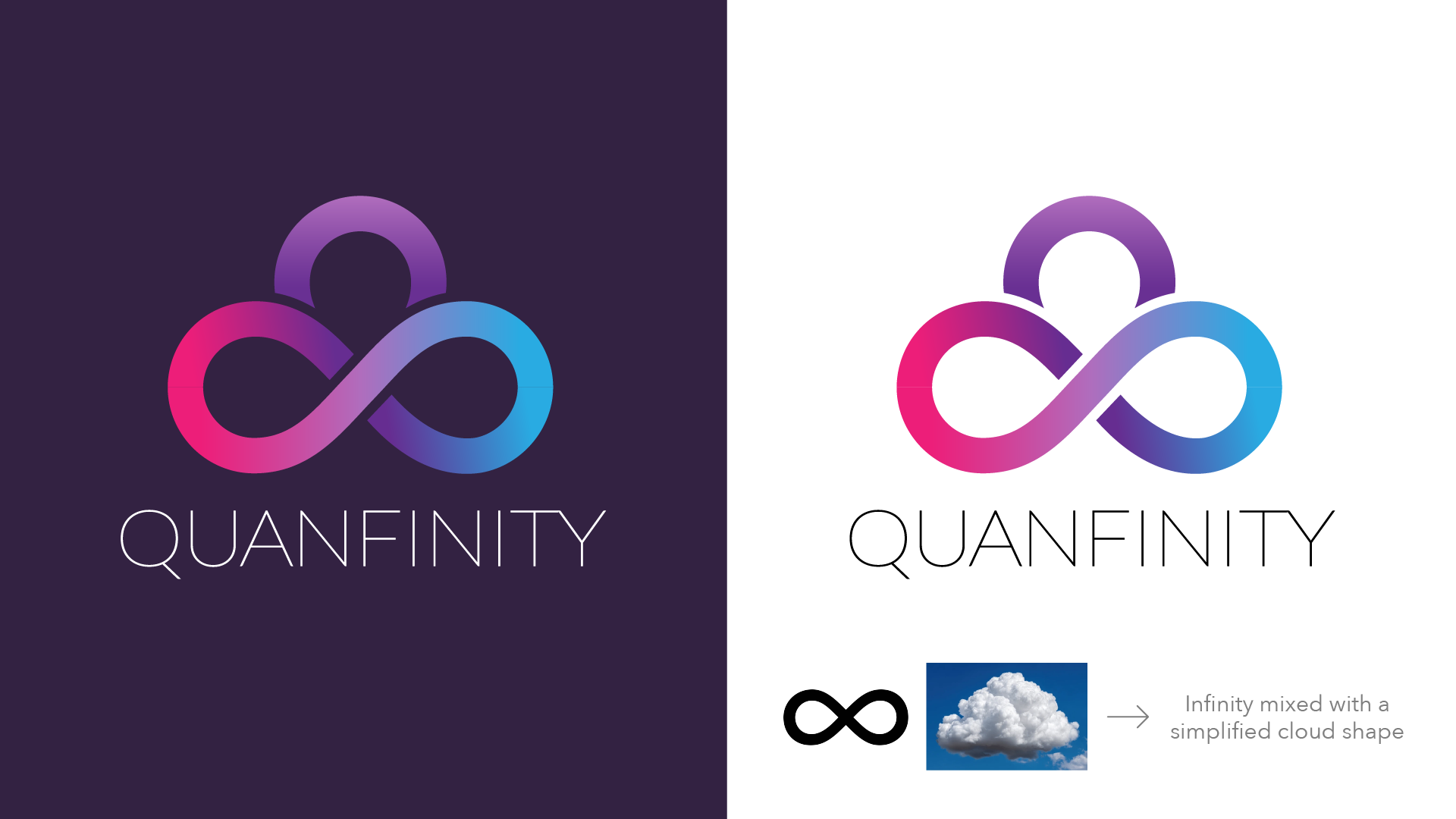
Brainstorm session - Logo & Name 3: A refined logo combining the infinity symbol with an added loop suggesting a simplified cloud, keeping the infinity motif recognizable. It communicates limitless opportunities and the expanded financial possibilities the new service offers.
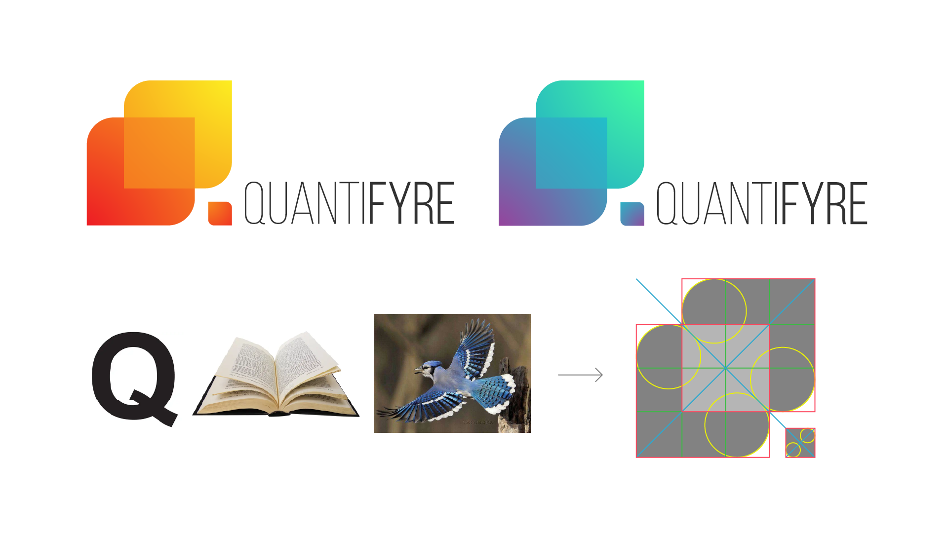
Brainstorm session - Logo & Name 4: I aimed for this name to give a sense of empowerment and numerical reference. I designed a distinctive “Q” shaped icon that abstractly reads as an opening book or bird wings. A flow of movement within the logo points up and right to resemble financial success indicated on line graphs.
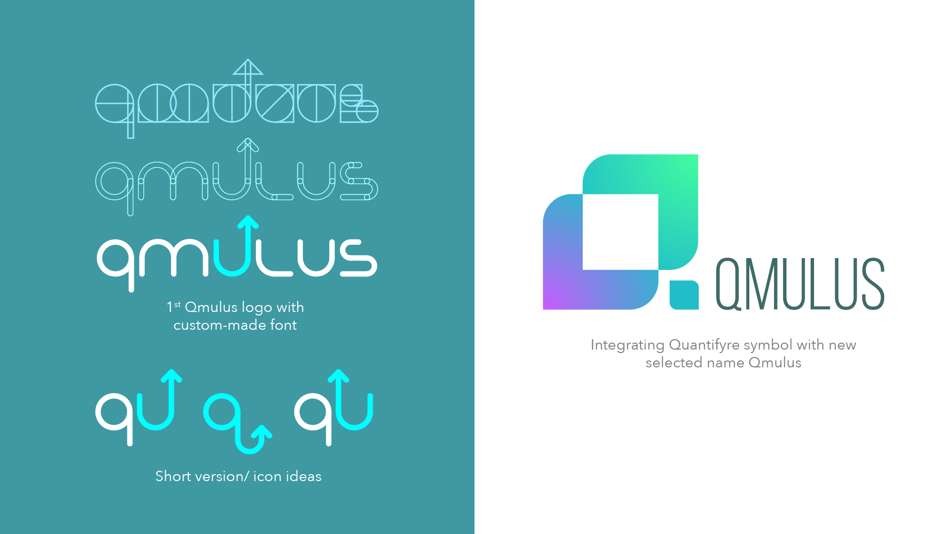
After 1st Feedback: I introduced the name "Qmulus," riffing on "cumulus" to reference the new cloud services. The unique "U" emphasizes customer focus with an upward arrow symbolizing success. SBLR preferred the earlier Quantifyre symbol and liked the new name "Qmulus."
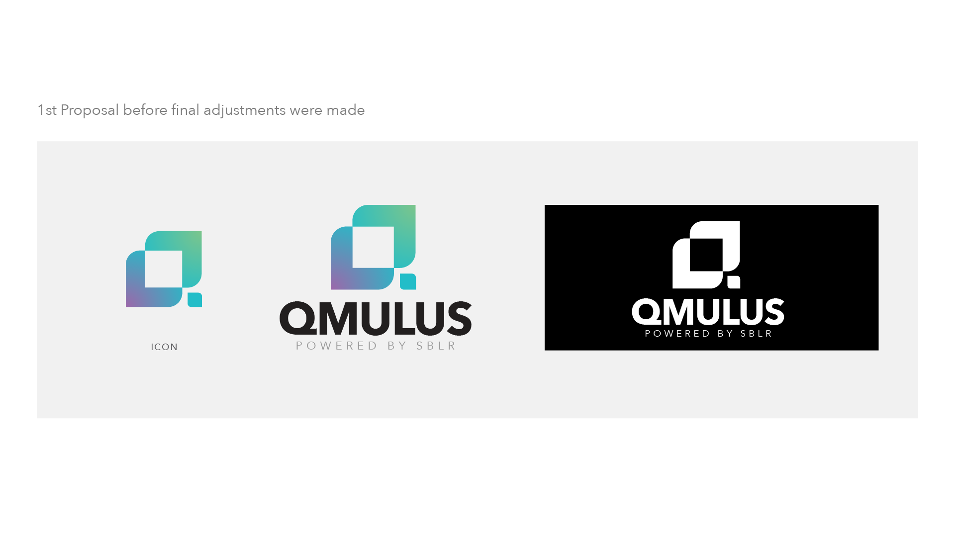
1st Proposal: Using client's chosen symbol and name. Close to how the final version turned out.
Following the 2nd feedback meeting, I made some adjustments to the colour palette, kerning, and detailing to the letters…